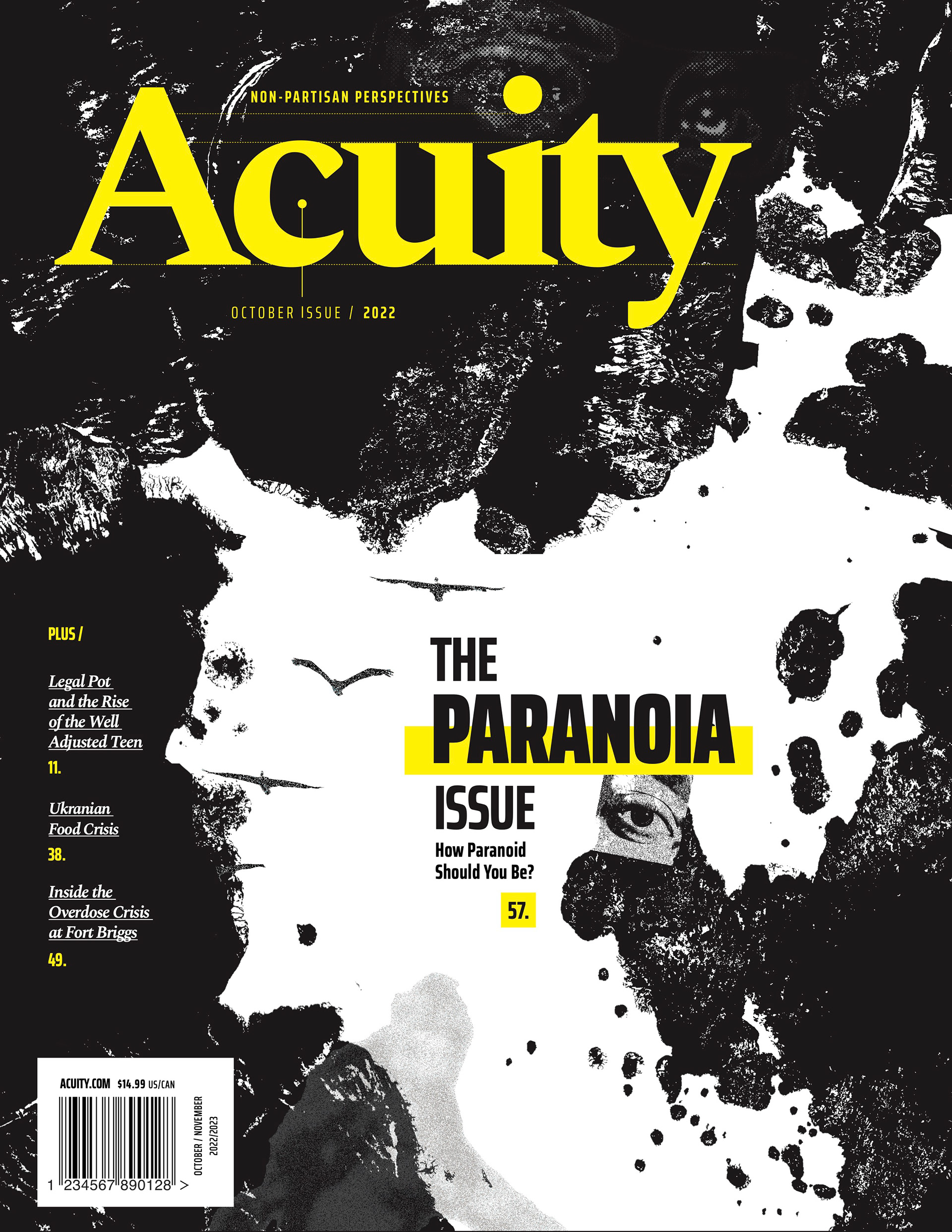
Magazine Cover (Above)
editorial / branding / publication design / print design
Design Objective:
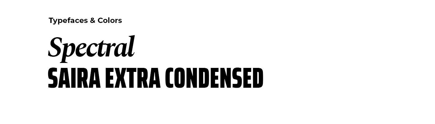
I was responsible for the design and branding of the political magazine, Acuity. My primary focus was on the cover page, which included a branded masthead, table of contents, pictorial, editor's letter, abbreviated masthead listing, feature issues, and a designated section for back-of-book advertisements. I emphasized creating clean and flexible typographic systems, with the masthead reflecting the magazine's commitment to detailed and diverse perspectives. The chosen typefaces complement each other, with the sophistication and character of the serif juxtaposing the boldness of the blocky sans serif, aligning with the non-partisan tone and tact of the magazine. I developed a design system that adapts and evolves with each issue, ensuring compatibility with mobile formats through a structured grid and linear layout.
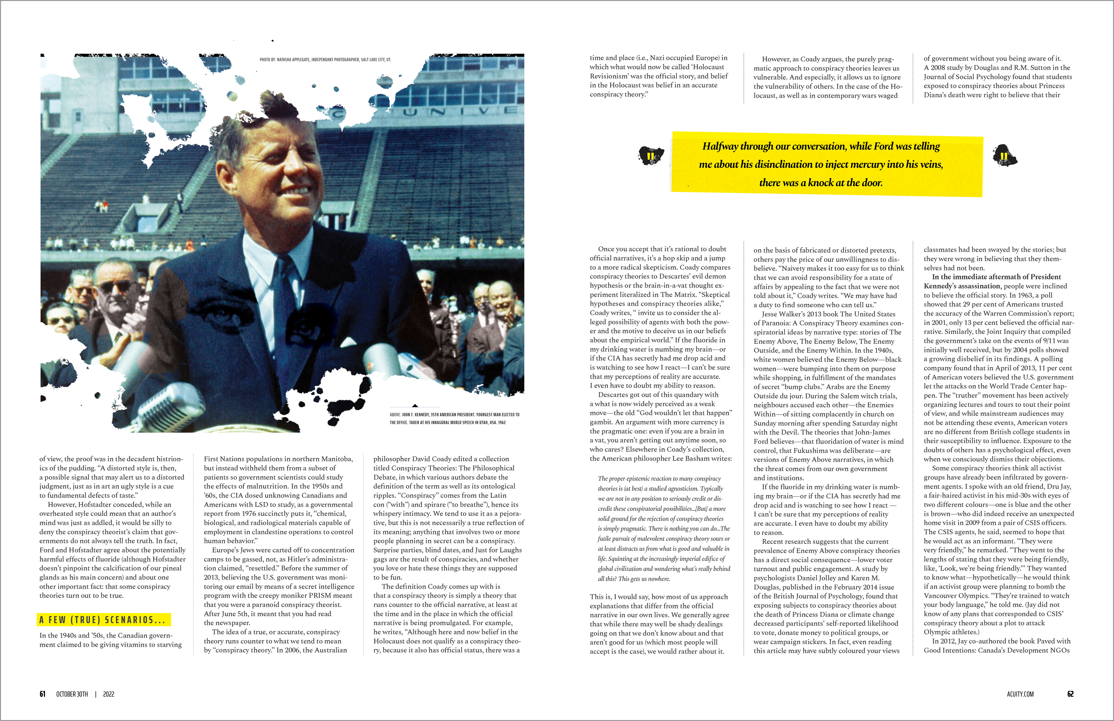
The October issue centered on the theme of paranoia. To create a striking visual for the cover and feature spread, I drew inspiration from the psychology of the Rorschach test. I hand-created inkblot patterns, scanned them, and then manipulated them in Photoshop to form deliberate shapes, playing into the idea of people seeing images in these patterns. These inkblots became a subtle design element throughout the issue, providing a cohesive yet theme-specific look.
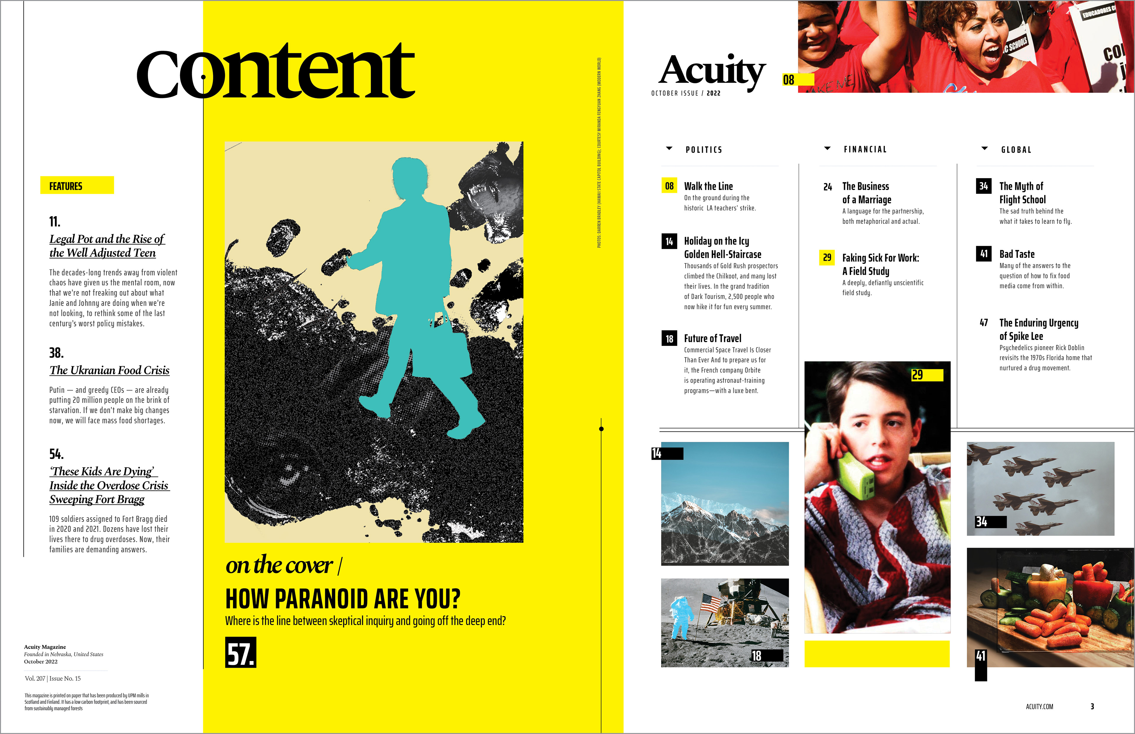
Table of Contents (Above)
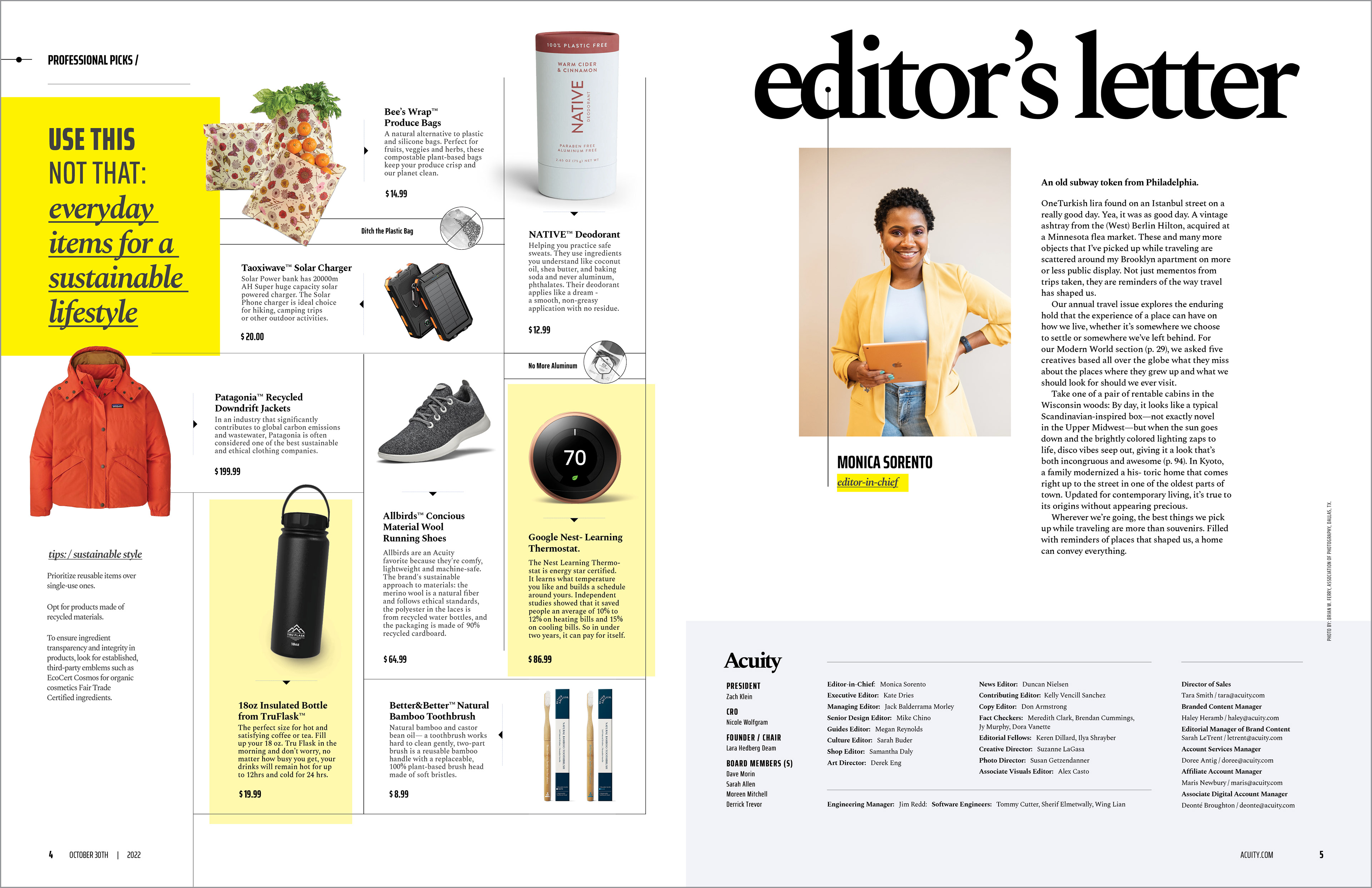
Pictorial & Editor's Letter (Above)
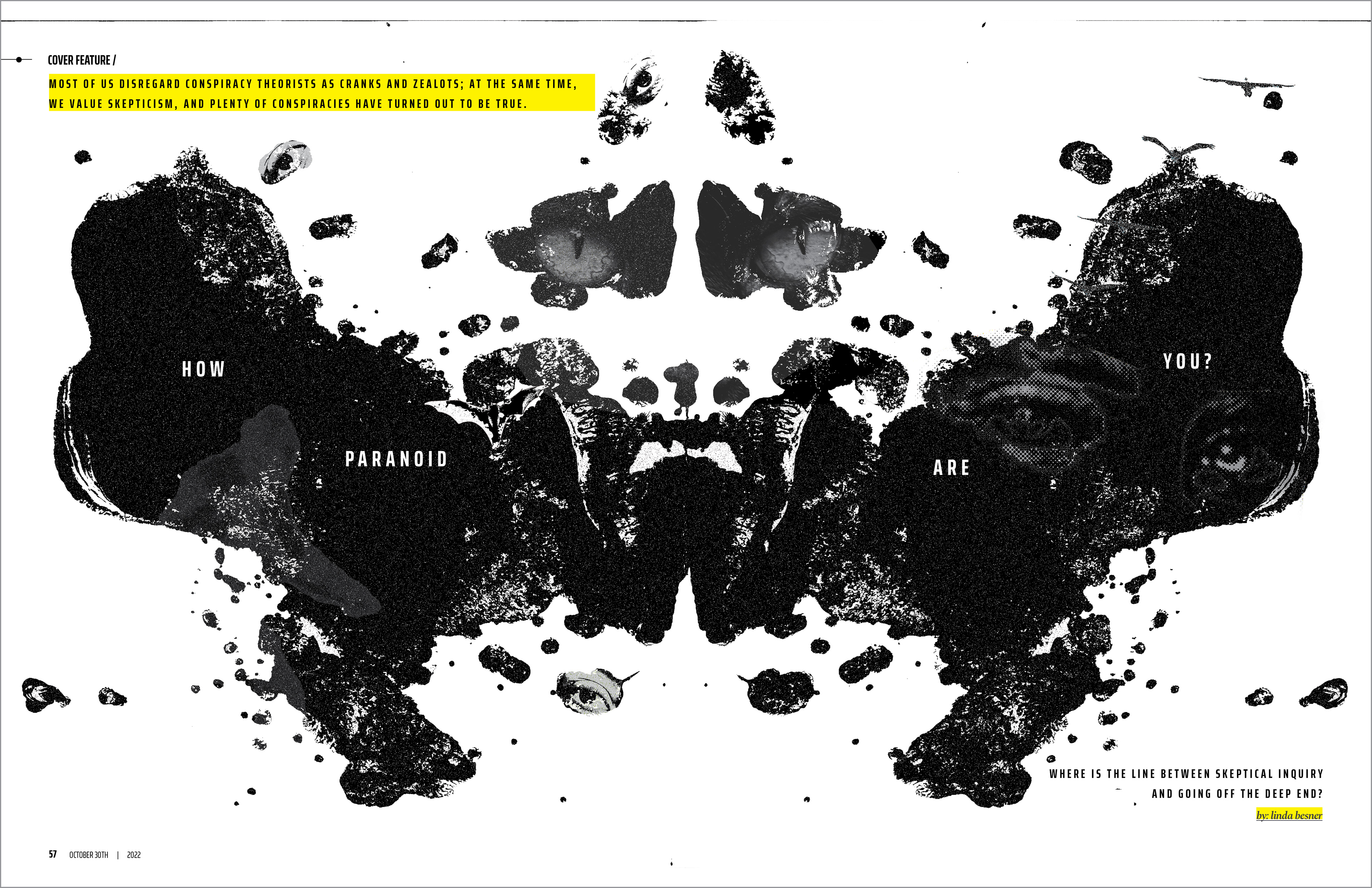
Cover Feature Spread (Above)
Secondary Feature Spread (Above)
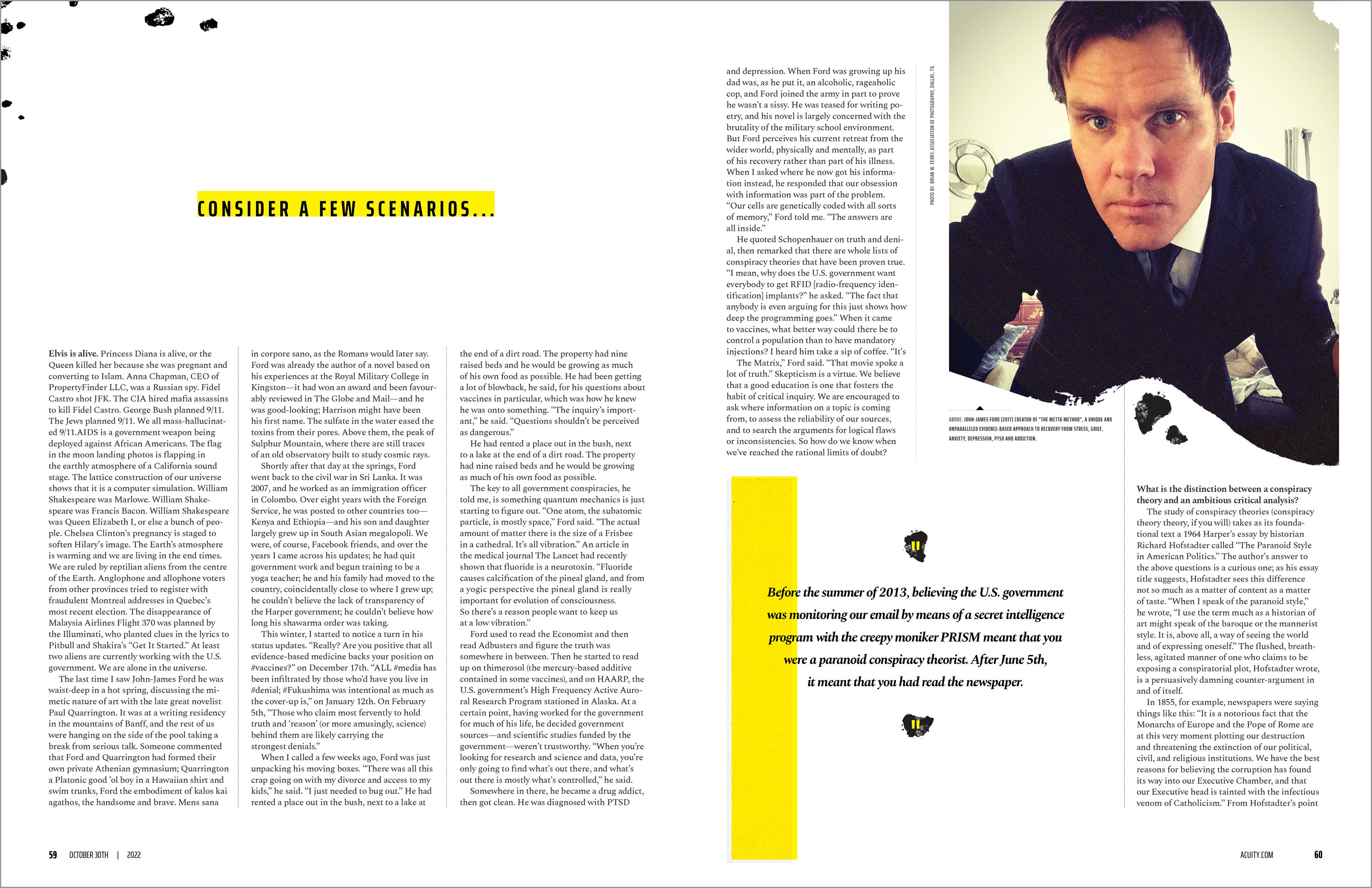
Tertiary Feature Spread (Above)
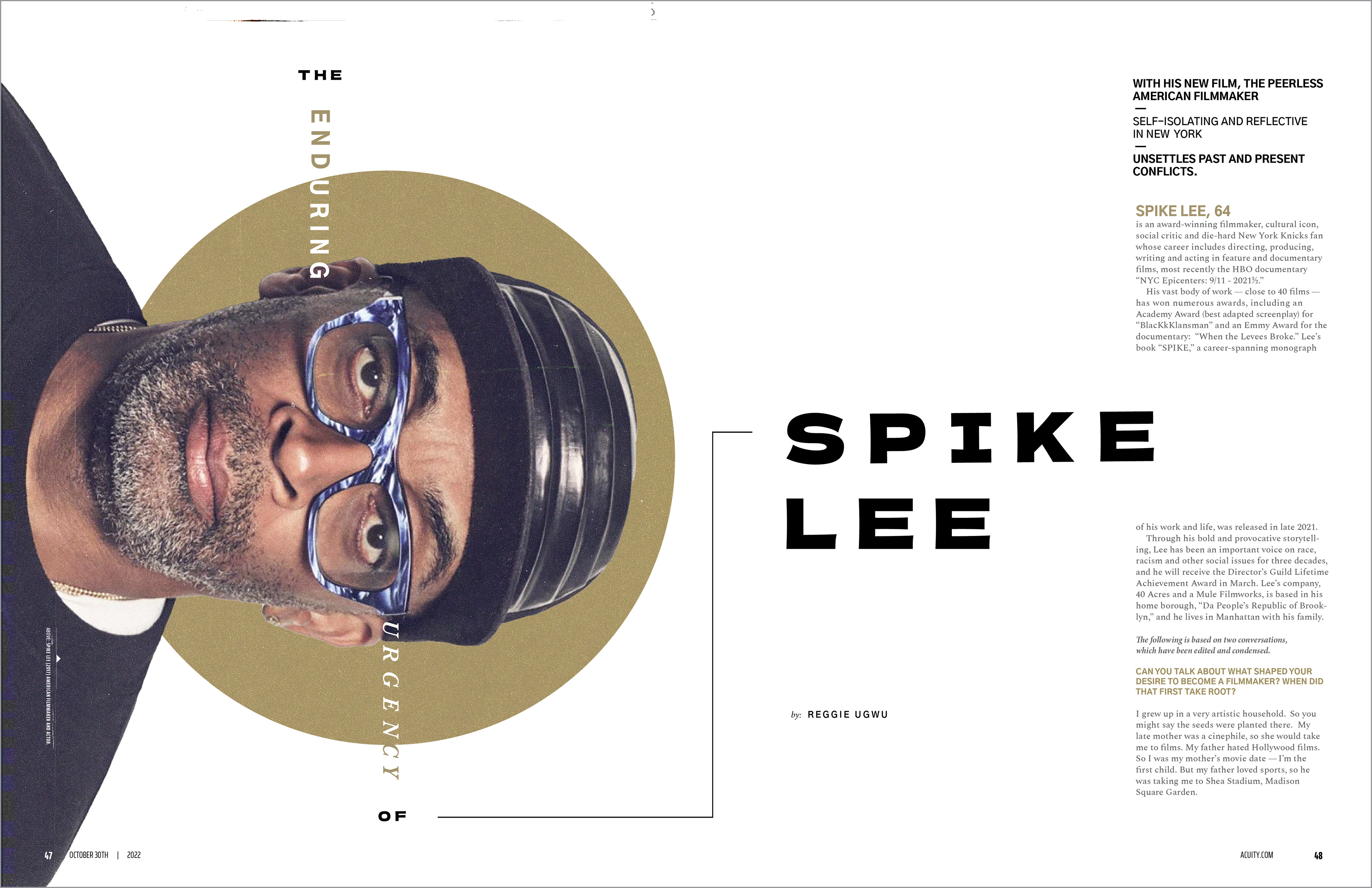
Spike Lee Article Spread (Above)
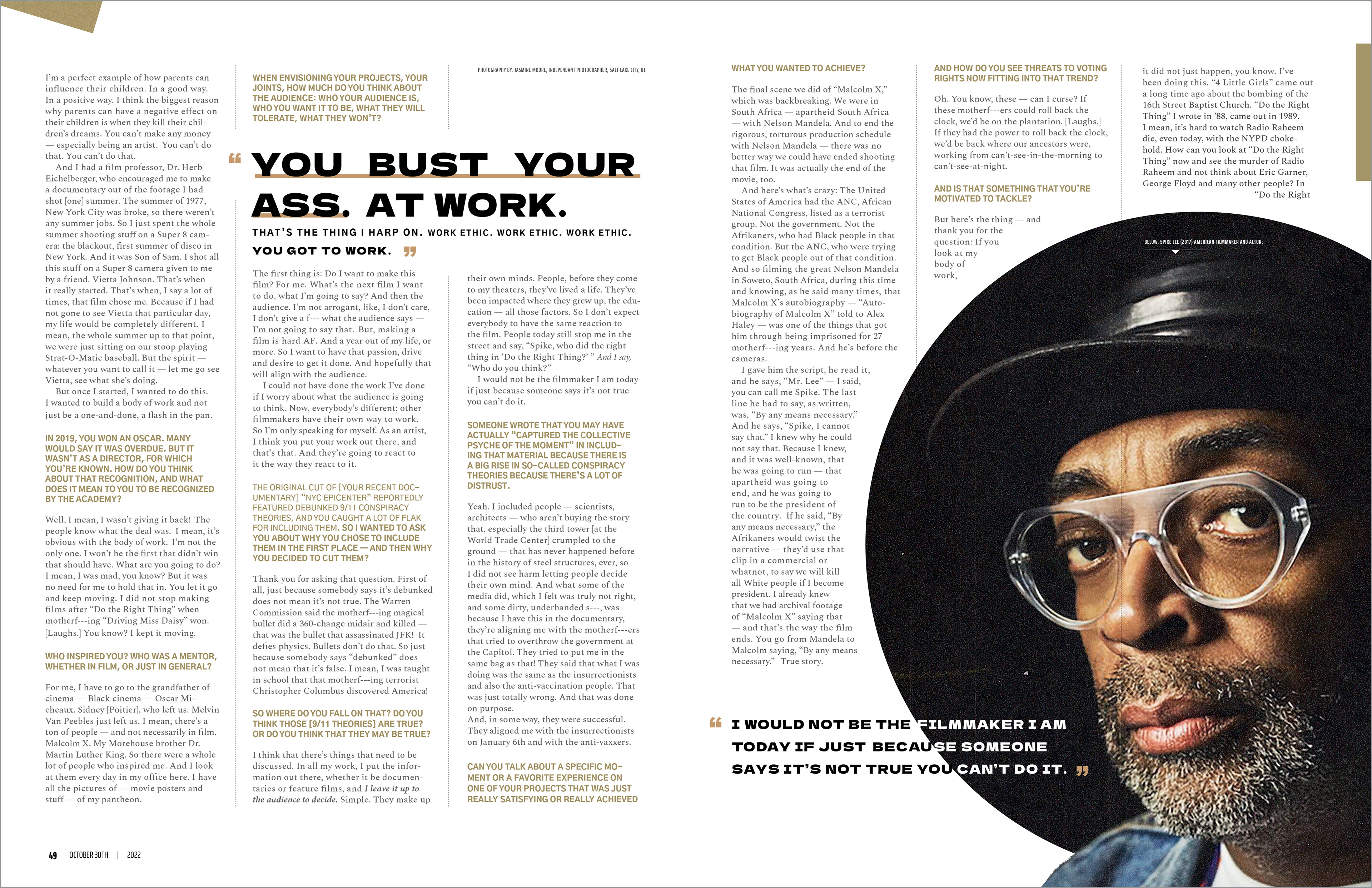
Spike Lee Article Secondary Spread (Above)